Sparkline specialized charts
Specialized charts present history without a conventional line or area. Equalizer and graded charts emphasize numeric levels, state bands show how named states change over time, and barcode charts emphasize value changes through color.
Shared color behavior
Specialized charts can calculate a color for every displayed bin or level. colorstops_transition controls whether the transition between configured colors is hard or smoothly interpolated.
1 2 3 4 5 6 7 8 9 10 | |
See Color Stops for reusable color-stop templates and threshold definitions.
Equalizer chart
Basic usage
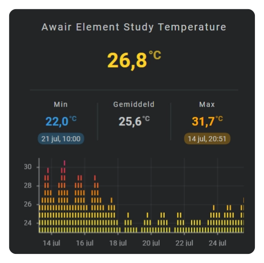
An equalizer divides the visible Y range into a configured number of levels and renders the active levels for every time bin.
| Equalizer chart |
|---|
 |
1 2 3 4 5 6 | |
Configuration fields
| Field | Required | Default | Description |
|---|---|---|---|
show.chart_type | Use equalizer to select the equalizer chart. | ||
equalizer.value_buckets | 10 | Sets the number of vertical value levels. | |
equalizer.square | false | Uses square levels when enabled. | |
equalizer.column_spacing | 1 | Sets the space between time bins. | |
equalizer.row_spacing | 1 | Sets the space between value levels. |
Styling
Equalizer levels use the configured entity color, line colors, or color stops. Per-bin color stops allow the levels to communicate both magnitude and threshold state.
Axes, grid, labels, and tooltip
| Display element | Support |
|---|---|
| X-axis | Yes, automatic. |
| Y-axis | Yes, automatic. |
| Grid | X and Y. |
| Tick marks | X and Y. |
| Labels | X and Y. |
| Tooltip and indicator | No. |
Graded chart
Basic usage
A graded chart converts every bin value into one of the ranks defined by its color stops. It is useful when the meaning of the grade is more important than the exact numeric position.
1 2 3 4 5 | |
Define ranks in the color-stop entries when their visual order differs from their numeric definition order.
Configuration fields
| Field | Required | Default | Description |
|---|---|---|---|
show.chart_type | Use graded to select the graded chart. | ||
graded.square | false | Uses square grade indicators when enabled. | |
equalizer.value_buckets | 10 | Sets the number of visible grade levels. | |
color_stops.colors | Supplies the values, colors, and optional ranks. |
Styling
The configured color-stop ranks determine the visible grade and its color. Use color-stop templates when multiple cards share the same grading scale.
Axes, grid, labels, and tooltip
| Display element | Support |
|---|---|
| X-axis | No. |
| Y-axis | No. |
| Grid | No. |
| Tick marks | No. |
| Labels | No. |
| Tooltip and indicator | No. |
State bands chart
Basic usage
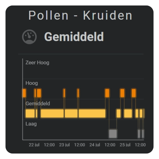
A state bands chart displays every mapped entity state on its own row. The horizontal length of a segment shows how long that state remained active. Rounded connections make the transition flow between rows easily visible.
| State bands chart |
|---|
 |
1 2 3 4 5 6 7 8 9 10 11 12 13 14 15 16 17 18 19 20 21 22 23 24 25 26 27 28 29 30 31 32 33 34 35 36 37 38 39 | |
The value determines the vertical row and selects the matching color stop. Omit label to use the translated Home Assistant state label where one is available. State bands always use discrete colors; smooth color interpolation does not apply.
Configuration fields
| Field | Required | Default | Description |
|---|---|---|---|
show.chart_type | Use state_bands to select the state bands chart. | ||
state_map.type | Use state_value to map named states to numeric rows. | ||
state_map.map | Defines each source state, numeric row value, and optional display label. | ||
color_stops.colors | [] | Assigns a color to each mapped numeric value. Without color stops, the normal graph color is used. | |
state_bands.radius | 0.5 | Sets the corner radius of foreground segments. | |
state_bands.update_interval | 5min | Controls how often the current segment advances when the entity state does not change. | |
state_bands.styles | stroke-width: 0 | Styles the foreground state segments. | |
state_bands.background.padding | 0.75 | Sets the visible border around foreground segments. | |
state_bands.background.connection_width | 0.375 | Sets the width of the transition connections between rows. | |
state_bands.background.styles | opacity: 0.3 | Styles the connected background layer. |
Styling
The foreground uses the color stop assigned to each mapped value. The separate background follows the same row colors and connects consecutive segments. Use state_bands.styles for the foreground and state_bands.background.styles for the connected layer behind it.
Axes, grid, labels, and tooltip
| Display element | Support |
|---|---|
| X-axis | Yes, automatic time axis. |
| Y-axis | Yes, categorical state rows. |
| Grid | X ticks and Y row separators. |
| Tick marks | X and Y. |
| Labels | X times and Y state labels. |
| Tooltip and indicator | Yes, per state segment. |
Move the pointer or a finger across the graph to inspect a state period. The indicator snaps to the center of the active segment, while the tooltip shows its state, start, end, and duration.
Barcode chart
Basic usage
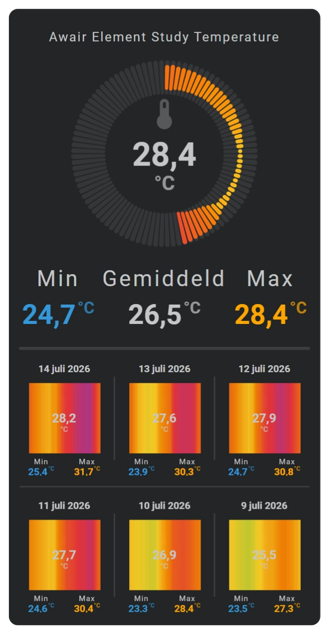
A barcode renders one narrow colored segment for every time bin. Time runs from left to right, while the value is communicated by the color of each segment.
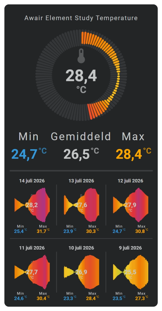
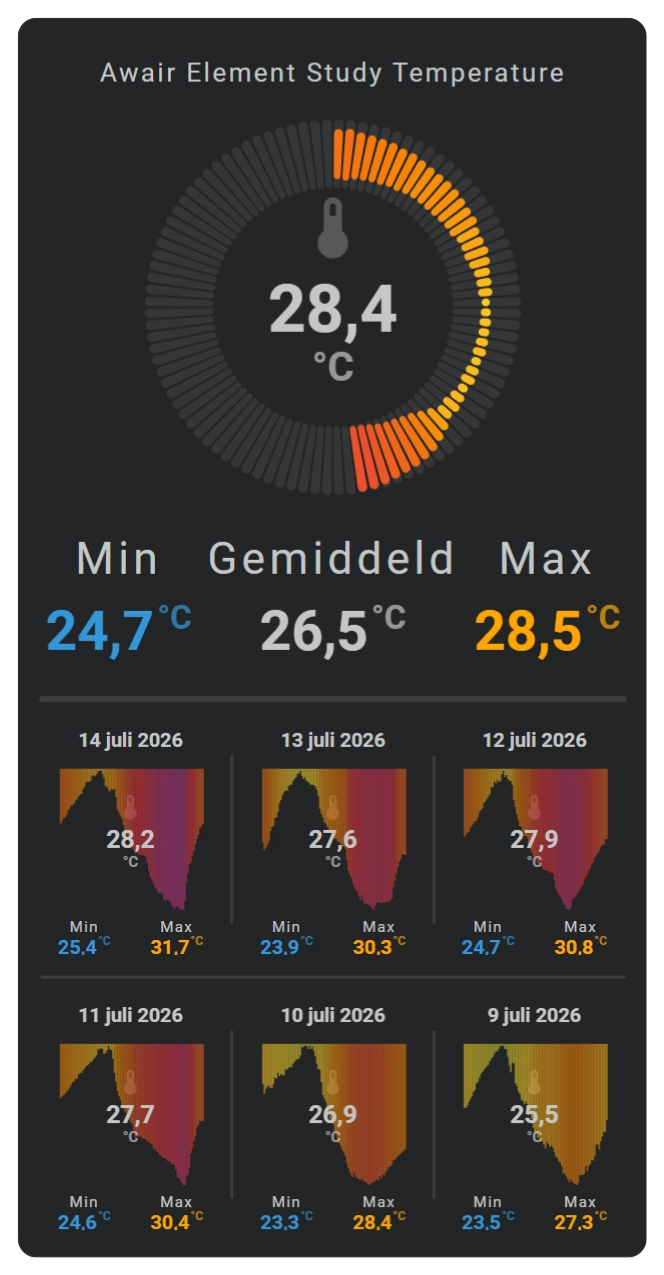
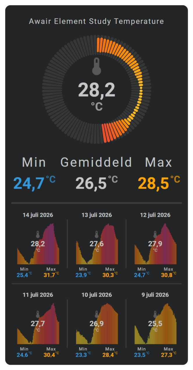
Below some of the variations. The top sparkline shows the current day with a radial barcode / audio / rice_grain visualization. The bottom 6 sparklines show the past week with their average (center) and min/max values at the bottom.
| Barcode | Barcode - Audio variant |
|---|---|
 |  |
| Barcode - Stalactites variant | Barcode - Stalagmites variant |
|---|---|
 |  |
1 2 3 4 5 6 7 8 9 10 11 12 13 | |
Each segment uses its own bin value. The current entity state is not applied to the complete historical barcode.
Omit chart_variant for full-height segments. Use audio for centered value bars, stalactites for bars growing down from the top, or stalagmites for bars growing up from the bottom.
Configuration fields
| Field | Required | Default | Description |
|---|---|---|---|
show.chart_type | Use barcode to select the barcode chart. | ||
show.chart_variant | Not set | Selects audio, stalactites, or stalagmites; omit it for full-height segments. | |
color_stops.colors | [] | Defines the value-based color of every segment. | |
colorstops_transition | smooth | Selects hard or smooth transitions between colors. | |
barcode.styles | {} | Applies SVG styles to the barcode segments. |
Styling
Use barcode.styles for the segment presentation. Color stops remain responsible for the data-driven color of each bin.
Axes, grid, labels, and tooltip
| Display element | Support |
|---|---|
| X-axis | Yes, automatic. |
| Y-axis | No. |
| Grid | X only. |
| Tick marks | X only. |
| Labels | X only. |
| Tooltip and indicator | Yes. |
Radial barcode chart
Basic usage
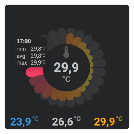
A radial barcode arranges the configured time bins around a circle. The complete configured period occupies the full ring from the first bin through the last bin.
| Radial Barcode chart - Sunburst variant - flower viz |
|---|
 |
1 2 3 4 5 6 7 8 9 10 11 12 13 14 15 16 17 18 | |
Move the pointer or a finger over the ring to inspect a segment. The active foreground segment is emphasized, the other foreground segments are dimmed relative to their configured opacity, and the tooltip shows the selected bin.
Omit chart_viz for regular ring segments. Use flower, flower2, or rice_grain to change the segment shape.
Omit chart_variant for a fixed-width ring. Use sunburst, sunburst_centered, sunburst_outward, or sunburst_inward to let each segment's radial size represent its value.
Configuration fields
| Field | Required | Default | Description |
|---|---|---|---|
show.chart_type | Use radial_barcode to select the radial barcode chart. | ||
show.chart_viz | Not set | Selects flower, flower2, or rice_grain; omit it for regular ring segments. | |
show.chart_variant | Not set | Selects a centered, outward, or inward sunburst value layout; omit it for a fixed-width ring. | |
radial_barcode.size | 5 | Sets the radial width of the barcode ring. | |
radial_barcode.line_width | 0 | Adds line width to the radial segments. | |
radial_barcode.background.styles | opacity: 0.3 | Styles the complete reference ring. | |
radial_barcode.foreground.styles | {} | Styles the data-driven foreground segments. | |
radial_barcode.face.show_day_night | false | Shows the day and night face. | |
radial_barcode.face.show_hour_marks | false | Shows hour marks. | |
radial_barcode.face.show_hour_numbers | false | Shows absolute or relative hour numbers. | |
radial_barcode.face.hour_marks_count | 24 | Sets the number of hour marks. |
Styling
Use foreground.styles for the colored data segments and background.styles for the reference ring behind them. Interaction changes the foreground emphasis temporarily and restores the configured styles when interaction ends.
Color stops calculate the color of every foreground segment from that segment's own bin value.
Axes, grid, labels, and tooltip
| Display element | Support |
|---|---|
| X-axis | No. |
| Y-axis | No. |
| Grid | No. |
| Tick marks | No. |
| Labels | No. |
| Tooltip | Yes, per radial segment. |
| Indicator | No. |