Sparkline graphs
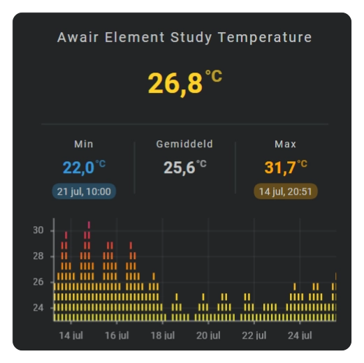
The sparkline section shows Home Assistant state history as a compact graph inside the card layout. Choose the time period, the amount of detail, and a chart type that suits the sensor. Axes, grid lines, labels, points, colors, and an interactive tooltip can then be shown as needed.
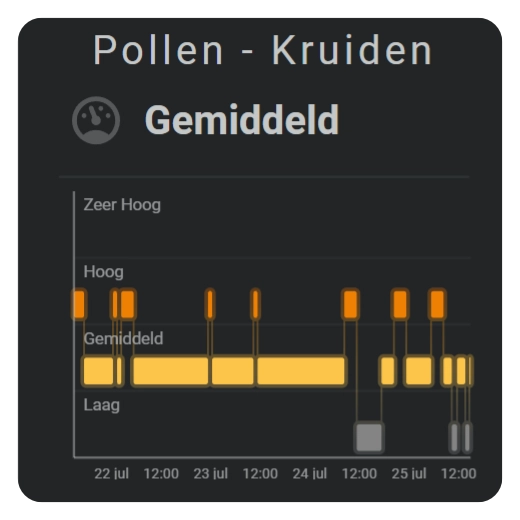
| Area | Barcode - Audio | Bars |
|---|---|---|
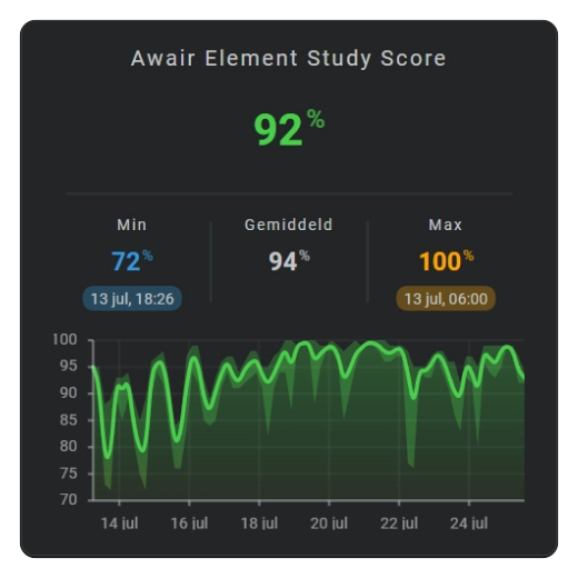 | 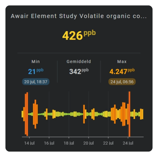 | 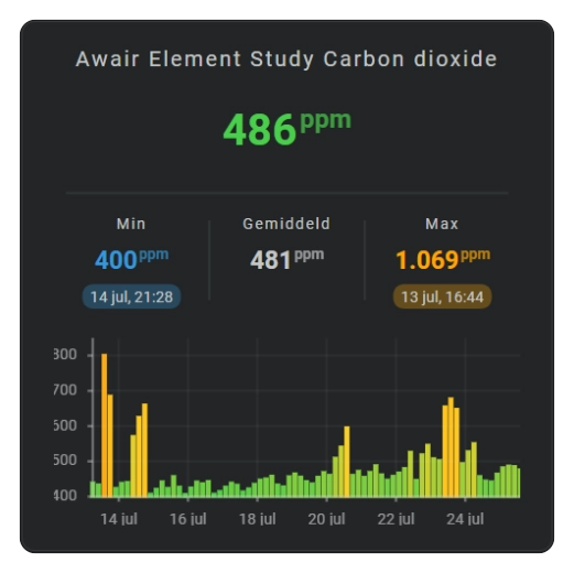 |
| Dots | Equalizer | State band |
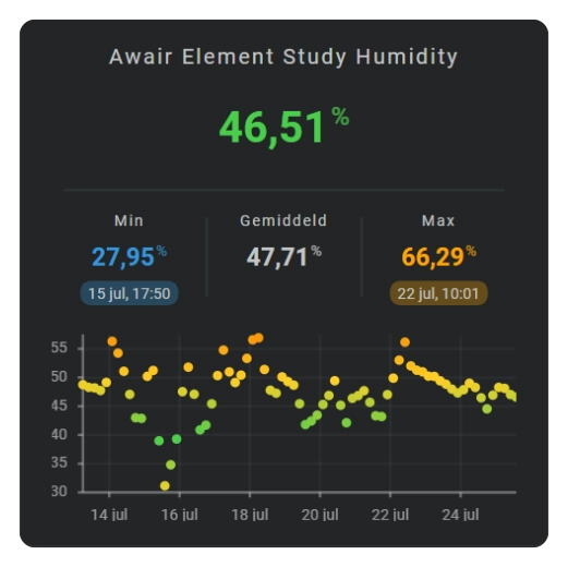 |  |  |
Basic usage
Add graphs to layout.sparklines and connect each graph to an entity with entity_index.
1 2 3 4 5 6 7 8 9 10 11 12 13 14 15 16 17 18 19 20 21 | |
The entity index refers to the card-level entities list. The graph uses the formatting settings of that entity for statistics and tooltip values.
Choose a setup
Start with the question the graph should answer:
| Goal | Recommended setup |
|---|---|
| Show the latest trend | rolling_window with a line or area chart. |
| Show today's progress | calendar with offset: 0. |
| Compare a completed day | calendar with a negative offset. |
| Preserve short peaks | Use more bins per hour. |
| Show a calmer overall trend | Use fewer bins per hour with aggregate_func: avg. |
| Show threshold changes instead of exact height | Use barcode or radial_barcode with color stops. |
| Show when named states were active | Use state_bands with a state map. |
For a current calendar period, the X-axis covers the complete period while the visible graph grows up to the current time. A rolling window moves forward continuously and always shows the latest configured duration.
Chart types
| Chart type | Geometry | Typical use |
|---|---|---|
line | Cartesian | Compact trend line. |
area | Cartesian | Trend with a filled area. |
dots | Cartesian | One separate dot per time bin. |
bar | Cartesian | One bar per time bin. |
equalizer | Binned levels | Stacked level display per bin. |
graded | Binned levels | Grade or traffic-light style values. |
state_bands | Categorical timeline | Duration and transitions of mapped states. |
barcode | Linear bins | Dense color history without a Y-axis. |
radial_barcode | Circular bins | Time bins arranged around a circle. |
Display support
| Chart type | X-axis | Y-axis | Grid | Axis labels | Tooltip |
|---|---|---|---|---|---|
line | Yes | Yes | X and Y | X and Y | Yes |
area | Yes | Yes | X and Y | X and Y | Yes |
dots | Yes | Yes | X and Y | X and Y | Yes |
bar | Yes | Yes | X and Y | X and Y | Yes |
equalizer | Yes | Yes | X and Y | X and Y | No |
graded | No | No | No | No | No |
state_bands | Yes | Yes | X and Y | X times and Y states | Yes |
barcode | Yes | No | X only | X only | Yes |
radial_barcode | No | No | No | No | Yes |
Points can be added to line and area charts. Use the standalone dots chart when every time bin should be displayed as a separate point without a connecting line.
Line, area, bar, grid, and axis behavior are documented in Cartesian Charts and Axes. Equalizer, graded, state bands, barcode, and radial barcode charts are documented in Specialized Charts.
Position and size
| Field | Default | Description |
|---|---|---|
entity_index | Entity used by the graph. | |
xpos | 50 | Horizontal center in FHS card coordinates. |
ypos | 50 | Vertical center in FHS card coordinates. |
width | 25 | Graph width in FHS card coordinates. |
height | 25 | Graph height in FHS card coordinates. |
margin | 0 | Inner graph margin; accepts one value or top, right, bottom, and left values. |
same_as | Reuses another sparkline definition. |
Margins reserve room inside the configured graph size. Cartesian labels and tick marks use this space; increasing the outer size does not change the requested history range or bin count.
Common sparkline fields
| Field | Description |
|---|---|
period | Selects realtime, rolling-window, or calendar data. |
state_values | Controls averaging, smoothing, value factors, and logarithmic display. |
show | Selects the chart type and visible graph parts. |
line_color | Defines the graph colors when no entity color or color stop applies. |
color_stops | Defines value-based graph colors. |
colorstops_transition | Selects hard or smooth color transitions. |
tooltip.styles | Styles the interactive tooltip. |
line and area | Style line and area charts. |
state_map and state_bands | Map named states and style a state bands chart. |
Show options
| Field | Description |
|---|---|
chart_type | Selects the visible graph type. |
line | Shows the line layer where applicable. |
area | Shows the area layer where applicable. |
grid.x and grid.y | Show the automatic grid for each supported axis. |
axis.x and axis.y | Show each supported axis independently. |
tickmarks.x and tickmarks.y | Show tick marks for each supported axis. |
labels.x and labels.y | Show labels for each supported axis. |
points | Shows one point for each graph bin. |
fill | Selects the applicable fill or fade behavior. |
Not every show option applies to every chart type. Radial barcode charts, for example, are circular and do not show a normal X-axis or vertical indicator.
For line, area, and bar charts, the X-axis and Y-axis are always determined automatically. Select each visible part with x and y; there is no need to configure tick intervals or scale boundaries.
Existing configurations that use a boolean, such as axis: true, continue to show both supported axes.
Color stops and statistics
Each bin retains the values required to calculate its aggregate and statistics. The tooltip can display the bin time together with minimum, average, and maximum values. These values use the connected entity's number formatting and unit.
Color stops can color complete paths or individual bins depending on the chart type. Barcode and radial barcode charts calculate the color from each bin value, while line and area charts can use a gradient across the value range.
See Color Stops for reusable color definitions and transition modes.