Bar chart
A Bar chart is one way to draw Sparkline history. Each displayed time interval becomes a separate bar, so individual intervals remain visually distinct instead of blending into one continuous line.
This page shows how to select the Bar chart, control spacing and fill, choose the history detail, and switch between vertical and horizontal bars.
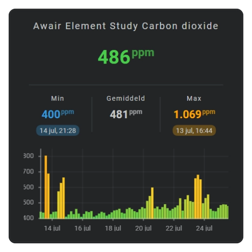
See: Sparkline History Template Card #060
Show history as bars
Use bars when each time interval should be compared as a separate magnitude rather than as a continuous curve.
Change the spacing between bars
Increase spacing when adjacent bars visually merge; decrease it when you want a denser history display.
Fade the bars
Use fading bars when solid bars are visually too heavy for the rest of the card.
Draw bars horizontally
Set orientation: horizontal to make each value extend left or right from the zero line. With history, time then runs from top to bottom because each time interval gets its own horizontal row. With real_time, there is only one current-value bar:
orientation: vertical for the default layout: time runs from left to right and values extend up or down from zero. Choose bar and track colors
bar.foreground.show.item_style controls the visible data bars:
auto— uses the chart's normal automatic color selection.none— hides the data bars.fixed— usesbar.foreground.color.colorstopsegments— gives each bar the discrete color-stop color for that bar's value.colorstopgradient— gives each bar the interpolated color between its neighboring color stops.
bar.background.show.item_style controls the optional full-height track behind the bars:
none— no background track.fixed— usesbar.background.color.colorstopsegments— draws hard color sections at the configured color-stop values.lineargradient— spreads the configured colors evenly across the complete track.colorstopgradient— draws a smooth gradient positioned by the configured color-stop values.
Configuration options
Required applies to the specific form described by that table: Yes means you need the field for that form; No means you can leave it out. Not set means the card adds no explicit value when the option is omitted.
| Option | Type | Required | Default | Description |
|---|---|---|---|---|
sparkline.show.chart_type | bar | Yes | line | Set this to bar to select this chart family; omitting it leaves the Sparkline as the default Line chart. |
sparkline.show.fill | solid, fade | No | solid | solid keeps one opacity through the bar fill; fade fades the fill. |
sparkline.bar.orientation | horizontal, vertical | No | vertical | vertical places time intervals from left to right and values extend up/down from zero. horizontal places time intervals from top to bottom and values extend left/right from zero; in real_time mode this becomes one horizontal current-value bar. |
sparkline.bar.column_spacing | number | No | 1 | Space between bars. |
sparkline.bar.foreground.show.item_style | auto, none, fixed, colorstopsegments, colorstopgradient | No | auto | Chooses automatic coloring, hides the data bars, uses foreground.color, uses one discrete stop color per bar value, or interpolates the bar color between stops. |
sparkline.bar.foreground.color | color | No | var(--primary-color) | Fixed data-bar color used when foreground.show.item_style: fixed. |
sparkline.bar.background.show.item_style | none, fixed, colorstopsegments, lineargradient, colorstopgradient | No | none | Hides the track, uses one fixed color, draws hard value-based sections, spreads colors evenly, or draws a smooth value-positioned gradient. |
sparkline.bar.background.color | color | No | var(--divider-color) | Fixed track color used when background.show.item_style: fixed. |
sparkline.state_values.aggregate_func | avg, median, max, min, first, last, sum, delta, diff | No | avg | Chooses the value represented by each historical bar; see History periods and bins for the meaning of each value. |
period.calendar.bins.per_hour / period.rolling_window.bins.per_hour | number/auto | No | auto | Number of bars per hour/automatic detail. |
series[].color | color | No | Automatic palette | Per-series color. |