Dots chart
A Dots chart is one way to draw Sparkline history. Each displayed time interval appears as a separate point with no connecting line, so individual values and gaps remain visible.
This page shows how to select the Dots chart, control point size, choose the history detail, and combine dots with the shared Sparkline axes and labels.
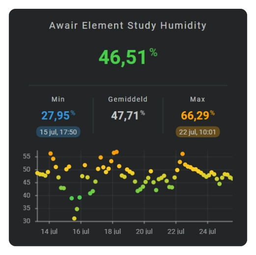
See: Sparkline History Template Card #060
Show a dots chart
Use dots when each aggregated interval should remain a separate visible sample with no line connecting it to the next.
Make the points larger or smaller
Change the dot radius when points are hard to see or visually overpower the graph.
Choose the value shown by each point
Use state_values.aggregate_func when each interval should show its average, minimum, maximum, or another supported aggregate.
Add axes and labels
Dots supports the normal Sparkline axes, grid, tick marks, and labels. See Axes and grid.
Configuration options
Required applies to the specific form described by that table: Yes means you need the field for that form; No means you can leave it out. Not set means the card adds no explicit value when the option is omitted.
| Option | Type | Required | Default | Description |
|---|---|---|---|---|
sparkline.show.chart_type | dots | Yes | line | Set this to dots to select this chart family; omitting it leaves the Sparkline as the default Line chart. |
sparkline.dots.radius | number | No | 2 | Size of every point; increase it when individual samples are hard to see and reduce it when points overlap. |
sparkline.state_values.aggregate_func | avg, median, max, min, first, last, sum, delta, diff | No | avg | Chooses the value represented by each historical point; see History periods and bins for the meaning of each choice. |
period.calendar.bins.per_hour / period.rolling_window.bins.per_hour | number/auto | No | auto | Number of points/time interval. |
sparkline.show.axis.x, sparkline.show.axis.y | boolean | No | false | Shows time and/or value axes when the position of each point needs a readable reference. |
sparkline.show.labels.x, sparkline.show.labels.y | boolean | No | false | Shows the corresponding time/value labels next to the axes. |
series[].color | color | No | Automatic palette | Per-series color. |