Graded chart
A Graded chart is one way to draw Sparkline history as ordered value ranges or severity levels. Instead of emphasizing exact height, it shows which configured grade each time interval belongs to, which is useful for scores, warnings, comfort levels, or other threshold-based data.
This page shows how to select the Graded chart, define its grades with color stops, and control the visible grade shapes.
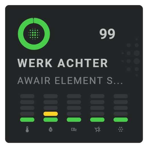
Show a graded chart
Use a graded chart when values should be grouped into discrete colored grades rather than shown as a continuous line.
Use explicit rank order
Set show.chart_variant: rank_order when the grade order should come from each color stop's rank value instead of the order of the configured color stops. This lets several value ranges share the same visible grade rank.
Change the grade shape
Use graded.square to switch between the supported square/rounded appearance.
Change the amount of history detail
The history period and bins determine how much time every displayed grade represents. Keep automatic bins for normal use and change density when needed.
Configuration options
Required applies to the specific form described by that table: Yes means you need the field for that form; No means you can leave it out. Not set means the card adds no explicit value when the option is omitted.
| Option | Type | Required | Default | Description |
|---|---|---|---|---|
sparkline.show.chart_type | graded | Yes | line | Set this to graded to select this chart family; omitting it leaves the Sparkline as the default Line chart. |
sparkline.show.chart_variant | rank_order | No | Not set | Uses each color stop's rank value to determine the visible grade order. |
sparkline.graded.square | boolean | No | false | false draws rounded grade blocks; true draws square grade blocks. |
sparkline.color_stops.colors[].value | number | Yes | — | Lower bound of a grade. |
sparkline.color_stops.colors[].color | color | Yes | — | Grade color. |
period.calendar.bins.per_hour / period.rolling_window.bins.per_hour | number/auto | No | auto | Controls how many history intervals are graded per hour; more bins preserve shorter changes. |