Radial chart
A Radial chart draws Sparkline history around a circle or partial arc instead of from left to right. Time follows the arc while distance from the center represents the value, and the history can be drawn as a line, filled area, or separate dots.
This page shows how to choose those variants, set the arc and radial width, show min/max ranges, add axes and labels, and use multiple radial series.
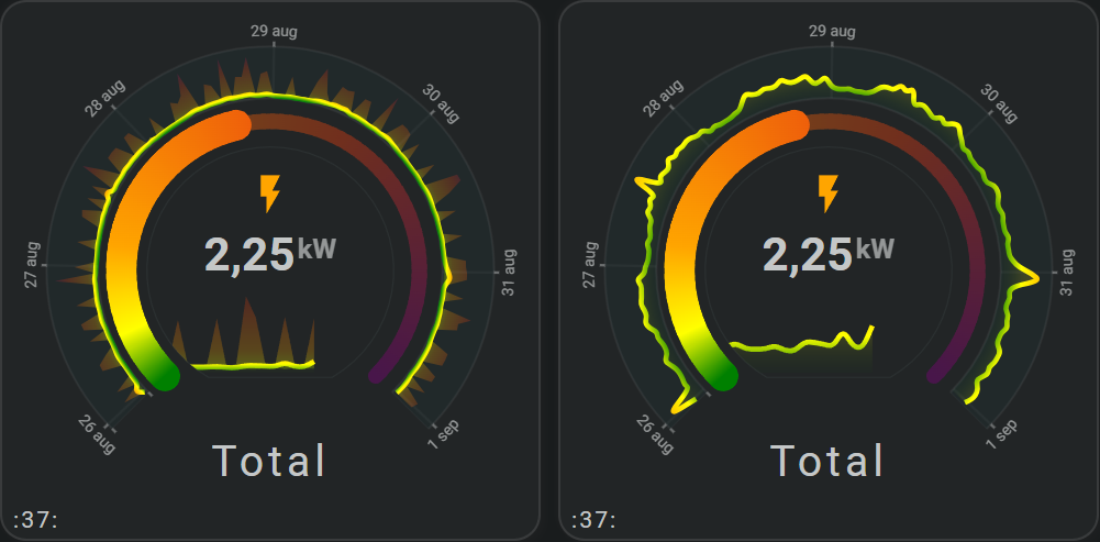
Show history around an arc
Use a radial chart when the same history should follow an arc instead of a left-to-right Cartesian graph.
Choose line, area, or dots
Set chart_variant:
line— connected history line;area— filled radial area;dots— separate points around the arc.
For an area, show.line, show.fill, and the normal area settings remain available. For dots, use dots.radius.
Change how much of the circle is used
Change the arc span when a full circle is unnecessary or would leave too little room for other card content.
arc_degrees changes the visible span. rotate moves its starting position. Change the radial width
Adjust the radial width when the history should sit closer to or farther from the center.
Show the min/max range
Line and area variants can show the minimum-to-maximum range for each interval using the matching line.show.minmax or area.show.minmax setting.
Add axes and labels
The X-axis follows time around the outer arc. The Y-axis runs radially. Use the same grid, axis, tickmarks, and labels controls as other supported Sparkline graphs.
Show multiple radial series
Multiple series share the same arc/time bins, while each series can choose its own radial line, area, or dots variant and color.
Configuration options
Required applies to the specific form described by that table: Yes means you need the field for that form; No means you can leave it out. Not set means the card adds no explicit value when the option is omitted.
| Option | Type | Required | Default | Description |
|---|---|---|---|---|
sparkline.show.chart_type | radial | Yes | line | Set this to radial to select this chart family; omitting it leaves the Sparkline as the default Line chart. |
sparkline.show.chart_variant | line, area, dots | No | line | line connects the history values, area fills the radial value band, and dots shows the individual interval values without a connecting line. |
sparkline.radial.arc_degrees | number | No | 360 | Amount of the circle used by the history; 360 uses the complete circle. |
sparkline.radial.rotate | number | No | 0 | Rotates the complete radial graph; positive and negative values turn it in opposite directions. |
sparkline.radial.size | number | No | 50 | Controls how much radial space is available for value differences; smaller values keep the graph in a narrower ring. |
sparkline.show.background | boolean | No | true | Shows plot background. |
sparkline.radial.background.styles | mapping | No | Theme defaults | Background appearance. |
sparkline.show.line | boolean | No | true | Shows or hides the line for the radial Line and Area variants. |
sparkline.show.fill | solid, fade | No | solid | For the radial area variant, solid keeps one opacity through the fill and fade reduces opacity away from the value line. |
sparkline.line.show.minmax | boolean | No | false | true shows the minimum-to-maximum range around the radial line; false hides it. |
sparkline.area.show.minmax | boolean | No | false | true shows the minimum-to-maximum range for the radial area; false hides it. |
sparkline.dots.radius | number | No | 2 | Size of each point when the radial Dots variant is used; larger values make individual intervals more prominent. |
sparkline.state_values.smoothing | boolean | No | true | true draws smooth connections between interval values; false connects them with straight segments. |
period.calendar.bins.per_hour / period.rolling_window.bins.per_hour | number/auto | No | auto | Controls how many history intervals are drawn per hour; more bins preserve more short-term detail. |