Sparkline graphs
A Sparkline shows how an entity changed over time inside a card. You choose which history period to show and how that history should be drawn, from a minimal line or area to bars, color bands, radial graphs, and other chart forms.
This page builds a basic Sparkline and introduces the main Sparkline topics: history periods, chart types, multiple series, axes and labels, and day/night information.
From a minimal Sparkline...
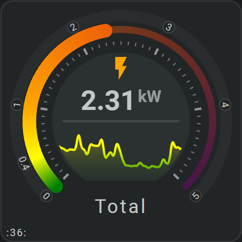
An area sparkline over a 24 hour period as part of a horseshoe:
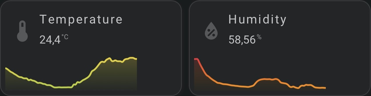
An area sparkline from today as period as part of a simple card with icon, name and state:
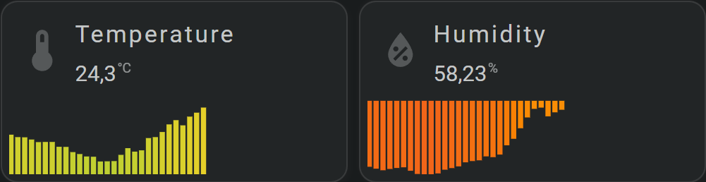
An bars sparkline (Card #062) from today as period as part of a simple card with icon, name and state:
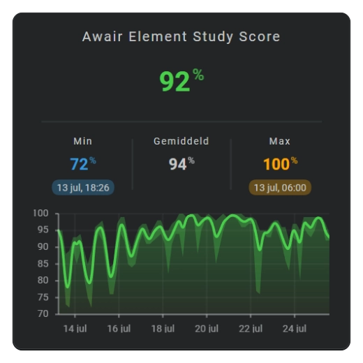
...to graphs with more information
Sparklines can also show axes, labels, multiple series, day/night information, value ranges, and several different graph forms.
| Area | Barcode | Bars |
|---|---|---|
 | 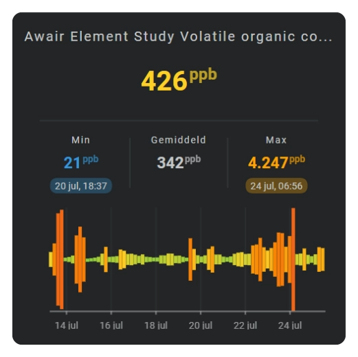 | 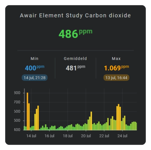 |
| Dots | Equalizer | State bands |
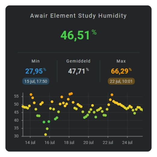 | 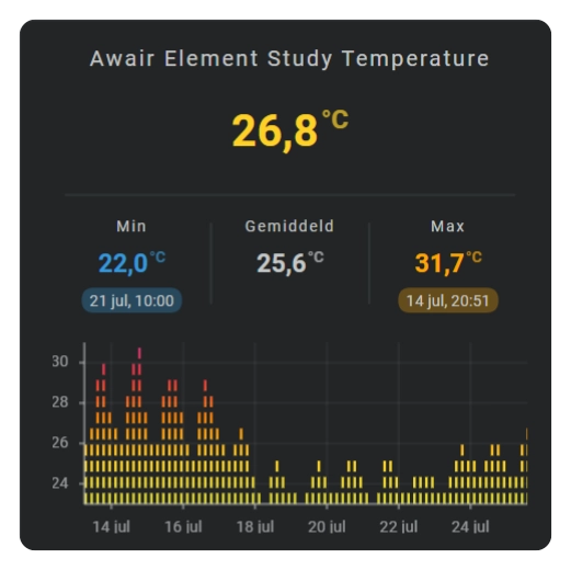 | 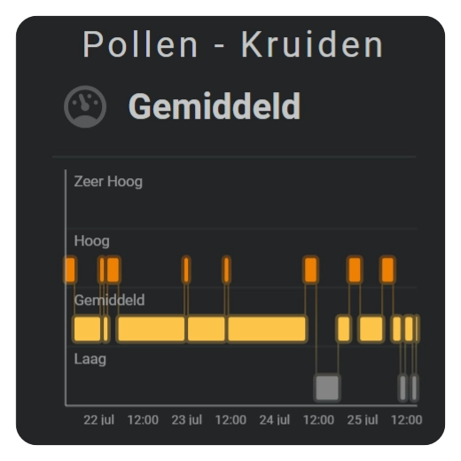 |
Add a basic Sparkline
A basic Sparkline turns one entity’s recent history into a compact graph inside the card.
This shows the latest 24 hours as a line. The card chooses a suitable interval automatically.
Choose the history period
Use the period that matches the history you want to see:
- latest 24 hours or another moving range;
- today;
- yesterday or another earlier calendar period;
- realtime/current value only;
- more or less detail inside the same period.
See History period.
Choose how the graph is shown
The chart type changes the visual form, not the entity or period.
sparkline.show.chart_type | What it shows |
|---|---|
line — Line | A connected trend line. |
area — Area | A trend with a filled area. |
bar — Bar | One bar per interval. |
dots — Dots | One point per interval. |
equalizer — Equalizer | Stacked value levels. |
state_bands — State bands | Named states over time. |
graded — Graded | Ordered value grades/ranges. |
barcode — Barcode | Color-coded history without a value height. |
radial — Radial | Line, area, or dots around an arc. |
radial_barcode — Radial barcode | Color-coded history around a circle. |
Show multiple series
Use series: when one graph should contain several entities or several periods from the same entity. In that form the history sources are defined inside series, so the top-level entity_index used by a single-source Sparkline is not needed.
See Multiple series for names, colors, legends, period overrides, and Y-axes.
Add axes, grid, and labels
Axes are optional. Add only the parts that help read the graph:
Show day and night
Add daylight/nighttime as a background or separate band when that helps explain a daily pattern. See Day and night.
Use Sparkline values elsewhere in the card
A Sparkline can make calculated values available to other tools in the same card. Add the values you want to entities: as fhs_sparkline.* entities, then use their entity_index like any other entity configured for the card.
These are FHS-generated entities. They exist only inside the card and are not Home Assistant entities.
For a Sparkline with id: temperature_history, the entity name is built from the Sparkline ID and the value you want to use:
The available value suffixes are:
| Suffix | Value |
|---|---|
min | Lowest value in the Sparkline data. |
avg | Average value in the Sparkline data. |
max | Highest value in the Sparkline data. |
min_time | Time at which the minimum value occurs. |
max_time | Time at which the maximum value occurs. |
duration | Duration of the active historical period. |
bin_duration | Duration represented by one displayed history bin. |
aggregate_func | Aggregation function used for the history bins, such as avg, min, or max. |
Values from an explicit series
When the Sparkline contains a series: list, each series has its own id. That series ID is added between the Sparkline ID and the value suffix.
This example defines a series with id: bedroom and exposes its minimum as fhs_sparkline.room_history_bedroom_min:
The naming pattern for an explicit series is fhs_sparkline.<sparkline_id>_<series_id>_<value>.
See Multiple series for how to configure series themselves.
Configuration reference
A Sparkline can get its history from one top-level entity or from an explicit series list. Keep those two entry methods separate; after the history source is chosen, the same graph options apply to both.
One history source
| Field | Type | Required | Default | Description |
|---|---|---|---|---|
entity_index | entity index | No | 0 | Entity whose history is shown; for a single-source Sparkline, omitting this field uses the first configured entity. |
Multiple history sources or periods
| Field | Type | Required | Default | Description |
|---|---|---|---|---|
series | list | Yes | — | Defines two or more graph series, or several periods of the same entity. Each series contains its own source/settings. |
Options for every Sparkline
| Field | Type | Required | Default | Description |
|---|---|---|---|---|
xpos | number | No | 50 | Horizontal position of the graph center. |
ypos | number | No | 50 | Vertical position of the graph center. |
width | number | No | 25 | Graph width. |
height | number | No | 25 | Graph height. |
margin | number / mapping | No | 0 | Adds space between the graph data and the graph area's edges when labels or marks need room. |
period | mapping | No | Calendar / 24 hours | Chooses which history range is loaded and how it is divided into intervals. |
sparkline | mapping | No | Defaults applied | Chooses chart type, value aggregation, colors, and chart-specific appearance. |
x_axis | mapping | No | Default axis appearance | Configures the time axis when it is shown. |
y_axis | mapping | No | Default axis appearance | Configures the value axis when it is shown. |
sparkline.legend | mapping | No | Hidden | Configures the series legend; sparkline.show.legend makes it visible. |
same_as | string | No | Not set | Reuses another Sparkline definition and lets this item override only the differences. |