State bands
State bands are a Sparkline chart type for entities whose history consists of named states instead of meaningful numeric values. The graph shows which state was active at each time and how long it lasted, which suits modes, occupancy, alarms, doors, or other categorical history.
This page shows how to map named states to visible levels, color those states, and add time/state axes and labels.
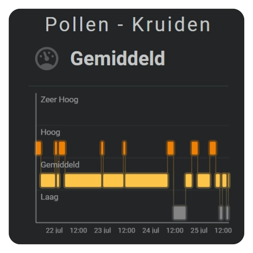
Show named states over time
Use state bands for entities whose history consists of named states such as off, heating, or open rather than continuous numbers.
Add colors to the states
Give each named state a color when the timeline should be readable without inspecting every text label.
Show time and state labels
Add labels when the viewer needs to identify both when a state occurred and which state level is being shown.
Keep the current state extending to now
state_bands.update_interval controls how often an unchanged current state extends toward the current time. The normal default is 5min.
Configuration options
Required applies to the specific form described by that table: Yes means you need the field for that form; No means you can leave it out. Not set means the card adds no explicit value when the option is omitted.
| Option | Type | Required | Default | Description |
|---|---|---|---|---|
sparkline.show.chart_type | state_bands | Yes | line | Set this to state_bands to select this chart family; omitting it leaves the Sparkline as the default Line chart. |
sparkline.state_map.map[].state | string | Yes | — | Home Assistant state to match. |
sparkline.state_map.map[].label | string | No | State text | Visible state label. |
sparkline.state_map.map[].value | number | Yes | — | Vertical state level. |
sparkline.state_bands.update_interval | duration | No | 5min | Refresh interval for an ongoing state. |
sparkline.color_stops | mapping | No | Not set | Gives each named state its own color so the history can be recognized without reading every label. |
sparkline.show.axis.x/y | boolean | No | false | Shows the time axis and/or the state-level axis when those references help interpret the bands. |
sparkline.show.labels.x/y | boolean | No | false | Shows readable time and/or state labels next to the corresponding axes. |